-
Cycle Analysis S&P500
In this article, I study long term cycles and cyclic behavior of the US stock market. The aim of the study is identification of dominant and practically useful cycles. In particular, I’m interested in cyclic behavior that is projected to appear in the next 6-12 months.
Therefore, in the first part of this article I apply offline math and Python scripting to identify important cycles. In the second part I use my [PI] cycle analyzer indicator in Tradestation to assess the quality of the identified cycles in context of real recent market data.
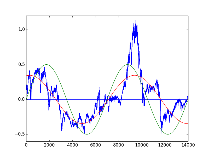
The underlying data for this study is the S&P 500 (SPX) since 1960. The following chart shows the logarithmic SPX over that time span.
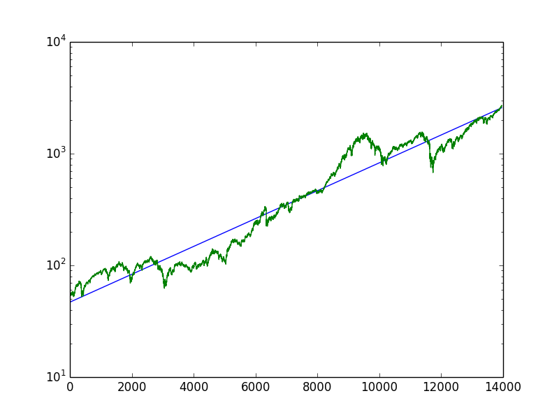
The chart also shows the regression line (blue) over the entire period. This regression line is the long term average trend (LTAT). The market price (naturally) oscillates above and below that LTAT. The oscillation for the last 65 years is isolated and shown in the following plot:

Now, relative to the LTAT, we can see that the market was expensive at the end of the 1960s and in 2000, and it was cheap at the early 1980s and around 2010.
While a long time prediction based on this limited amount of data is not very meaningful, let’s try it anyway. In fact the data bluntly indicates the presence of a 30 year (+-) cycle, with highs in 1970 and 2000 and lows in 1980 and 2010. I’ve added such a manual fit as (green) sine curve to the plot. I also added a mathematical (curve fitted) fit, which is closer to a 38 year cycle.The conclusions from this first exercise are:
1. For really long time analysis we need way more data (duh)
2. From the data we see, we can derive a 30-40 year cycle which now in 2018 is closer to the bottom than to the top
3. By no means we can consider the current market prices as overly expensive – because we are merely at the center of the LTAT
4. If the cycle is true and fully unfolds, we can expect the SPX at least to double (rather triple) in the next 10 yearsAt this point our approximation is composed of the LTAT and the 30 year cycle – which is pretty coarse and not really useful for a 6-12 month window. To refine the approximation and find smaller cycles we can repeat the curve fitting by:
1. Get the difference between approximation and actual market price
2. Find a wave form that matches the difference as good as possible
3. Apply the difference composition
And start over again – up to a point of demising return.As a first example, a composed approximation of a 38 year, 15 year and 7 year cycle, is shown as the green line in the chart below:
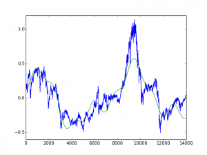
While the incremental fitting is mathematically interesting, its practical value seems to be limited. Firstly, the identified cycles change too rapidly with minor changes in equations or signal (because we calculate with errors of errors of errors). And second, while in average the approximation looks close to the actual market, in detail the derivations are significant. For example for the last two years the approximation indicated a down move which clearly was not seen in the actual market behavior.
So instead of having a composed signal, I rather want to study the cycles individually. The previous manual steps already pointed towards 7, 15, 38 years. But are those cycles really more dominant than others? And are there other, better matching cycles? To answer this question, I performed a spectral analysis of the (de-trended logarithm) underlying data. The result is a plot that shows the determined significance for each frequency. I already converted it to an annual period in the following plot.
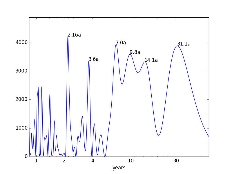
The dominant cycles are:
- 2.16 years (26 months)
- 3.6 years (43 months)
- (exactly) 7.0 years
- 9.8 years
- 14.1 years
- 31.1 years
The interesting (and surprising) results are:
- No (obvious) political cycles (4, 5, 8 years), also no significance for the saisonal 12 month cycle.
- No (obvious) planetary cycles (though the 2.16a cycle is very close to the 2.14 years of synodic Mars)
- The results are close to Tessaleno C. Devezas study on the historical GDP growth rates. Devezas identified the frequency peaks: 7.5, 15, 32 and 52 years.
Back to the charts
In the following I study the six identified six cycles on real recent market data. The goal is to see how the cycles worked out recently and what they predict for the near future.
I apply my [PI] Cycle Analyzer, which computes a the average price behavior for a given cycle length. I put the cyclic signal on top of the market data to get a quick visual assessment whether or not the market really picked up the cycle. The shown cycles are de-trended (i.e. it does not show the overall market up-trend) and are vertically stretched (i.e. it does not reflect actual prices). The cycles are intended to show relative market strength and weakness, originating from the cycle. Please also note that no single cycle is going to drive the market on its own.
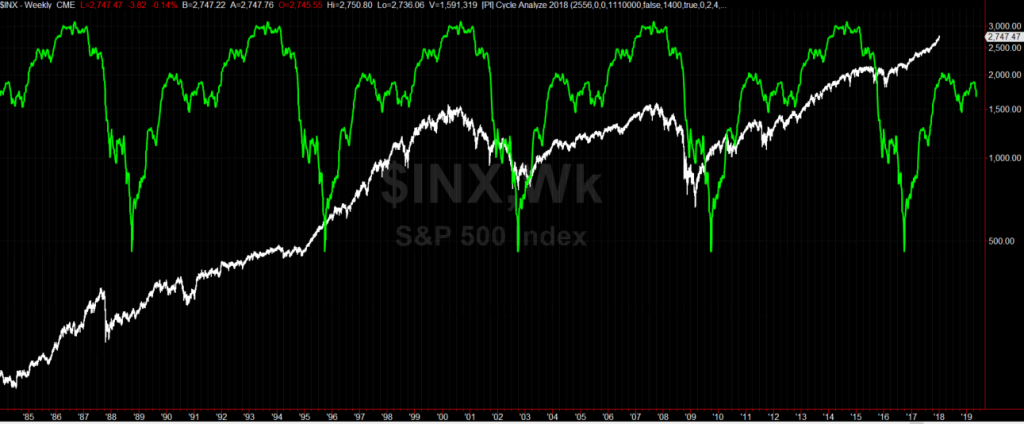
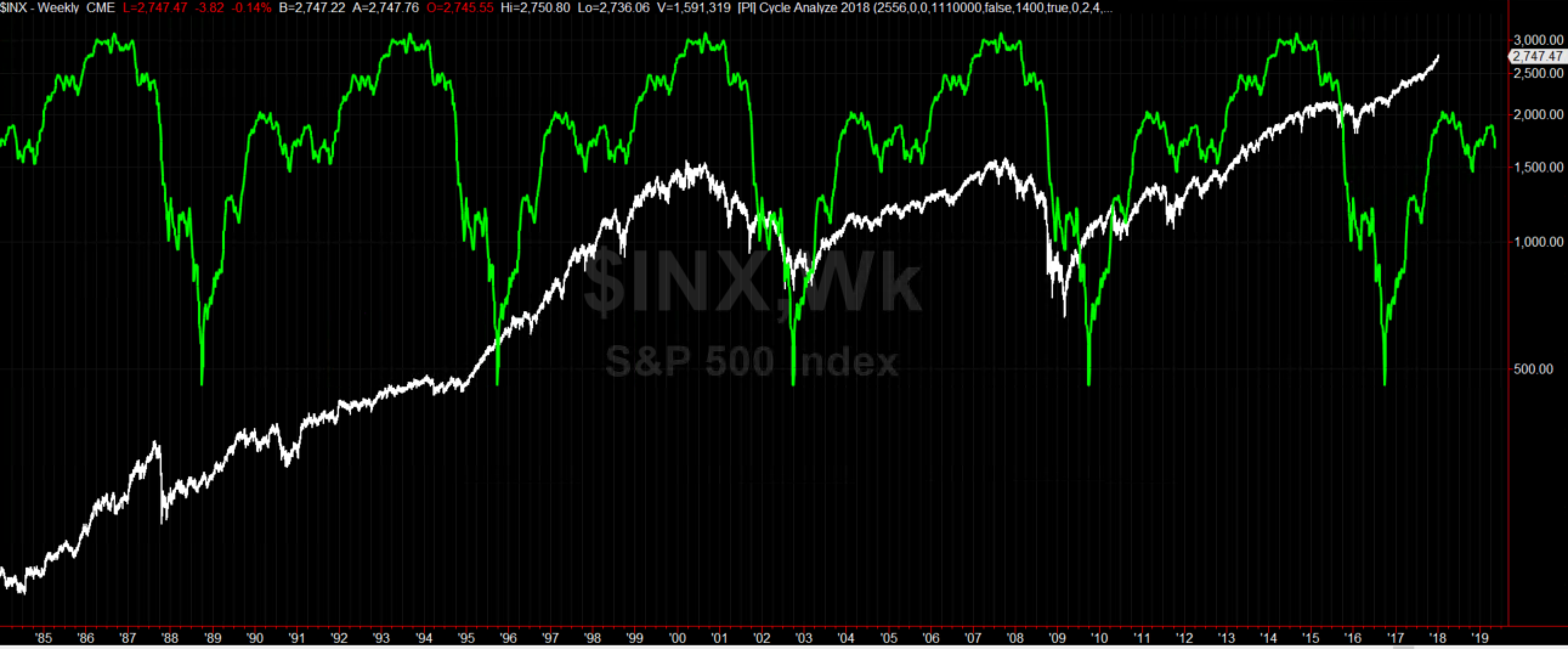
2.16 year cycle
The following chart shows the last 5 years of the SPX and the 26 month cycle. Even though the market was in a permanent up move, we see that all major correction in that time span are in sync with the down moves of the 26 month cycle (highlighted blue circles). While the pattern has diverged a bit in fall last year, the cycle is in sync with the steep up-move since October. For the next three months the cycle shows relative weakness, with a first low in Spring and a second low at the end of the year.
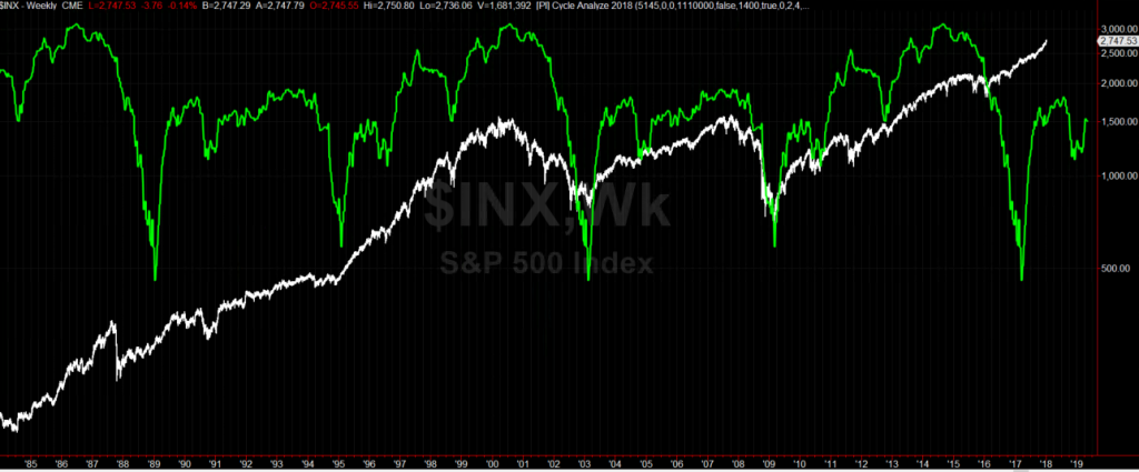
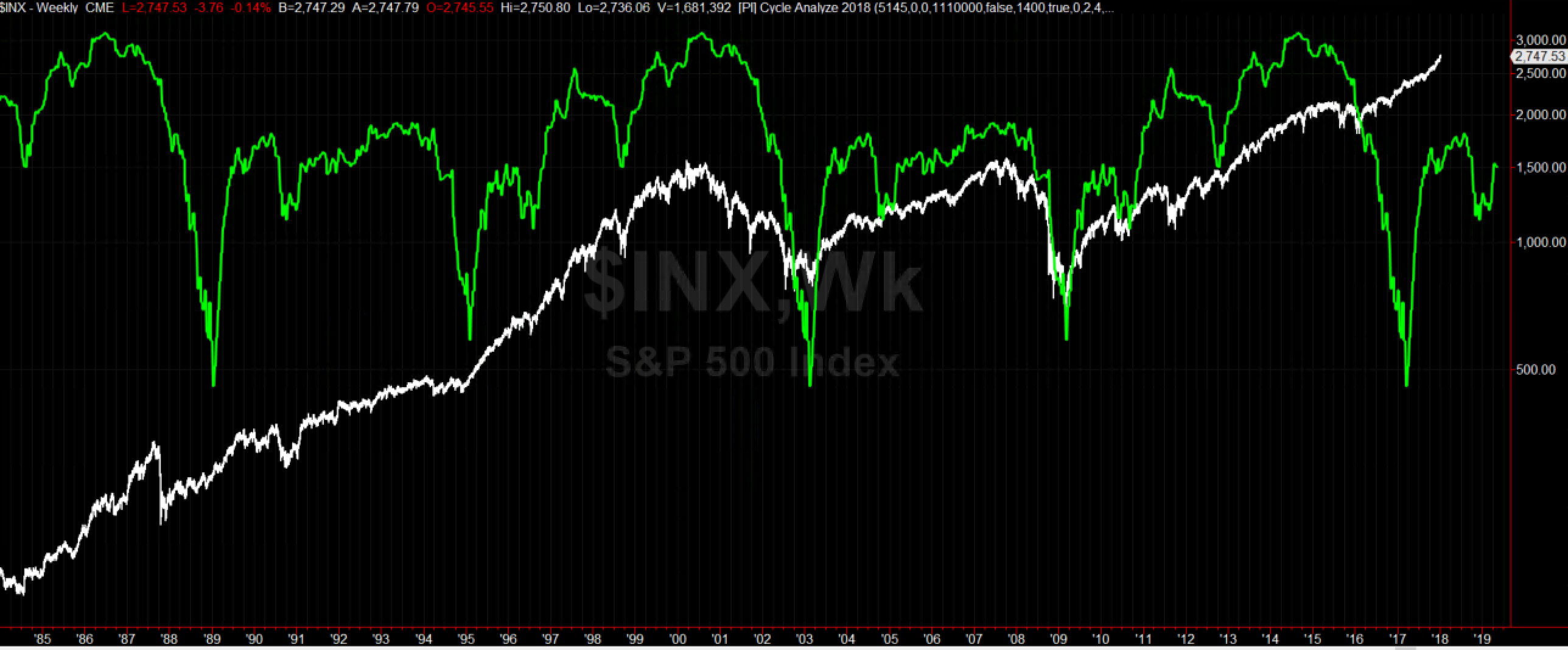
7 year cycle
The 7 year cycle, as shown in the chart below for the last 40 years, has a remarkable quality in timing market strength and weakness. It’s tops were in sync with the 2000 and 2007 market tops. The latest top was in sync with the 2014/16 market consolidation. The 7 year cycle is the only cycle that correctly showed strength for all 2017. For 2018 it shows a smaller consolidation similar to 2011 or 2004 – which might result in a 12-18 months sideways movement . The next significant top is in 2021.
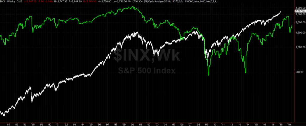
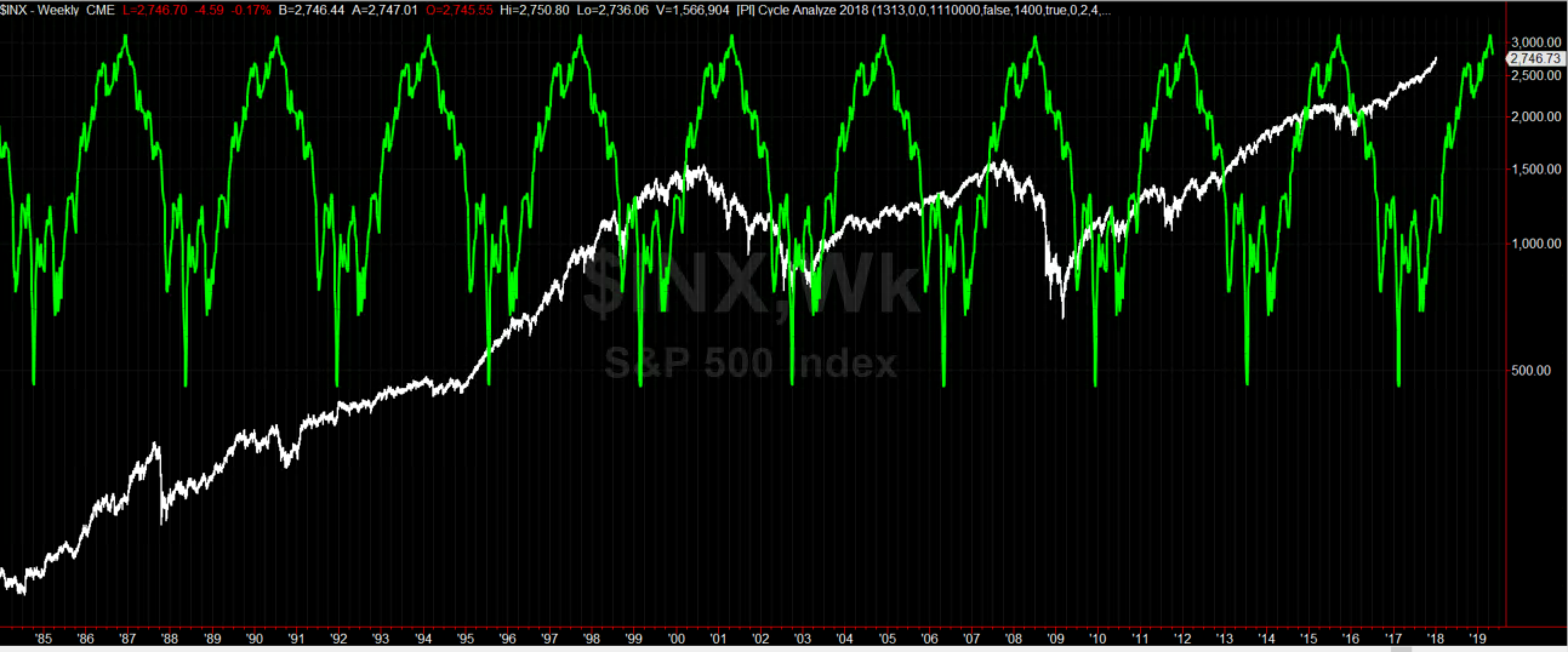
14.1 year cycle
The 14 year cycle combines alternating 6 and 8 year cycles. The cycle finished it’s 8 year sub-cycle with a low at the end of 2016 – and shows an up-move since then. The cycle shows a correction in the second half of 2018 – but the top of the cycle (not in the chart) is expected for 2021.
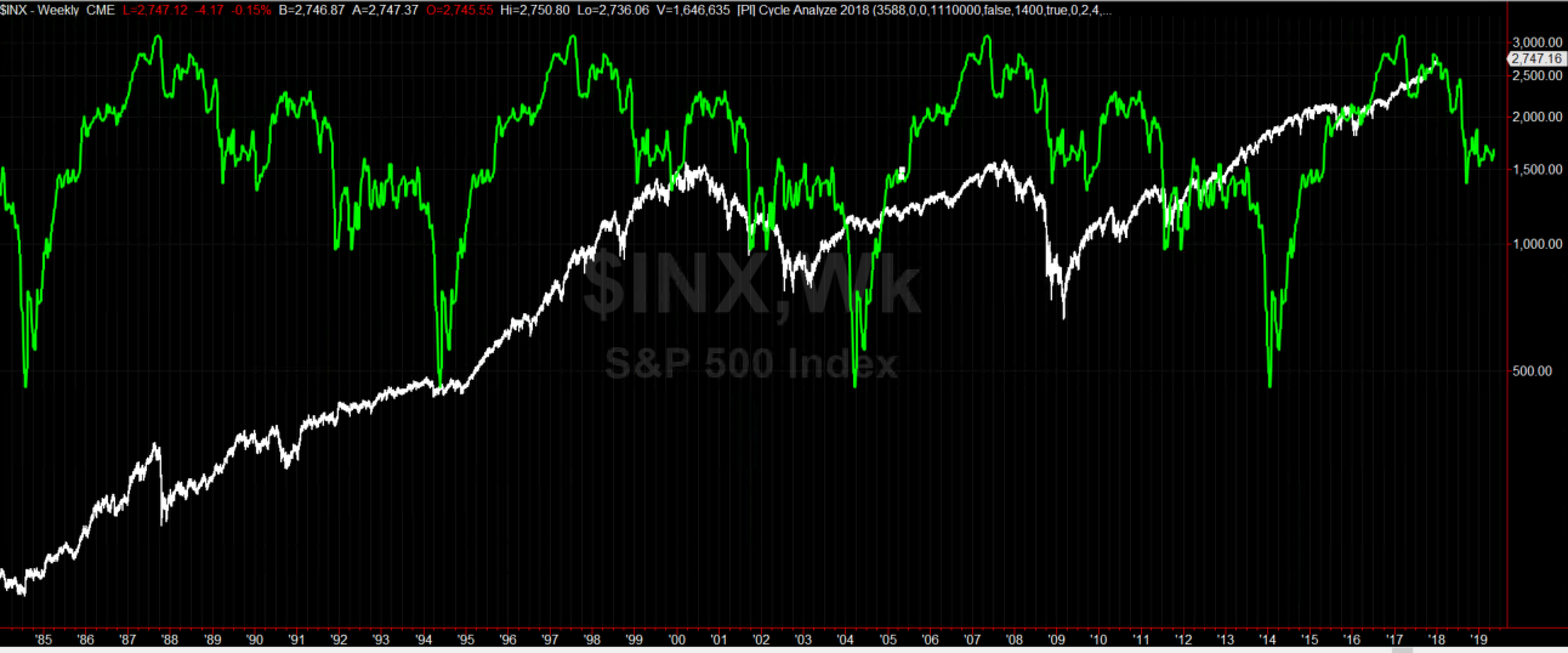
31.1 year cycle
The 31 year cycle as shown in the next chart is not really useful in the selected settings. Since it only went through two iterations, it mostly mirrors the training data. Recently, the 31 year cycle correctly anticipated the 2014/16 consolidation and the continuous upmove since then. Notable is that later this year we get to the cycle position of the 1987 crash.
3.6 and 9.8 year cycles.
The 3.6 cycle is in an up-move since 2017 and is going to top early 2019. The 9.8 year cycle made its top in 2017 and is descending until 2023, while a first acceleration of the down-move finishes at the end of 2018. Overall the two cycles do not match very well, which was already indicated in the relative weakness in the spectral analysis.


Conclusions
The market seems to be in the middle of a boom that is going to last another 10 to 15 years. That is why, even the overlapping declines in multiple smaller cycles (as in 2014-2016) is nothing more than a small dent – and overlapping ascents of multiple cycles (as in 2017) are overly powerful. 2018 shows consolidations in the recent high quality cycles (26 months, 7 years) with correlating lows in spring and in late fall of 2018. However, the overall up-trend shouldn’t be challenged before 2021.
As conclusion, my best guess for 2018 (and solely based on the cycles discussed in this article) is a path similar to 2011: consolidation in Spring, then sideways over Summer and a sell-off in Fall.
Restart 2018 Heliocentric Bradley vs Gold and Bonds
Cycle Analysis S&P500


Search
Recent Posts
- Update on S&P and 26 month cycle, 7 year cycle and Bradley
- Heliocentric Bradley vs Gold and Bonds
- Cycle Analysis S&P500
- Restart 2018
- Commitment of Traders: Sell signal in my new COT indicator
- Mid-November Low in S&P500
- Book recommendation: Timing Solutions for Swing Traders
- S&P: Time for a Turn?
- Indication of Planetary Returns in Tradestation
- Paintbar Study Showing when a Planet is in a Certain Sign
Tag Cloud